Seattle 9:23 pm
Seattle 9:23 pm
Seattle 9:23 pm

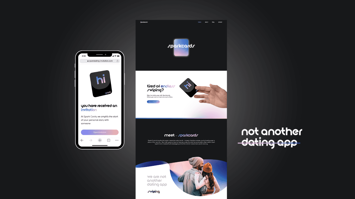
Bridging the gap between digital
interactions and real-world dating scene


Client:
Spark Cards
Year:
2024
Services: User Research, Wireframes, Design System, Collaboration, Leadership, Branding
|
|
Bridging the gap between digital
interactions and real-world dating scene


Client:
Spark Cards
Year:
2024
Services: User Research, Wireframes, Design System, Collaboration, Leadership, Branding
|
|


Founder @ Sparkcards
@Hussein Saab
Ex Amazon / Boeing / Accenture
“Comparing Nara to seasoned designers I've encountered, she stands in a league of her own. Her work ethic and the impact of her designs have set a new bar in UX design talent.”


Co-Founder
@Ana Espinoza
"What sets Nara apart is her ability to understand and capture the essence of a brand or concept, translating it into visually stunning designs. Nara has a unique ability to align her designs with our brand identity while infusing a fresh and contemporary aesthetic.”


Founding Developer
@NickT
"Nara is the GOAT, her work is fast as lighting, and she is always considerate of the built effort of her designs. Always cooperative during design + dev sessions. Amazing working with such a professional designer!"
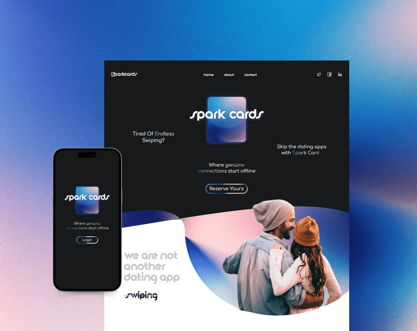

Digital Web & App Design
Competitive Research
Heuristics Evaluation
User flow & UI Design (WIP)
The Problem
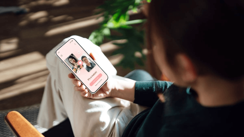
Spark Cards disrupts the online dating industry by infusing a grassroots and tangible element into the digital world. Spark Cards offers a refreshing and innovative approach to finding meaningful relationships, appealing to users seeking a more personal and intentional dating experience.
Lack of personal connection and authenticity
High risk of ghosting and non-responsiveness
Overwhelming number of options leading to decision paralysis
Privacy concerns and potential for fake profiles
Limited offline interaction and reliance on technology

Empathizing with our users
Narrowing in the problem
10
Focus groups
300
User Interviews
2600
User Insights
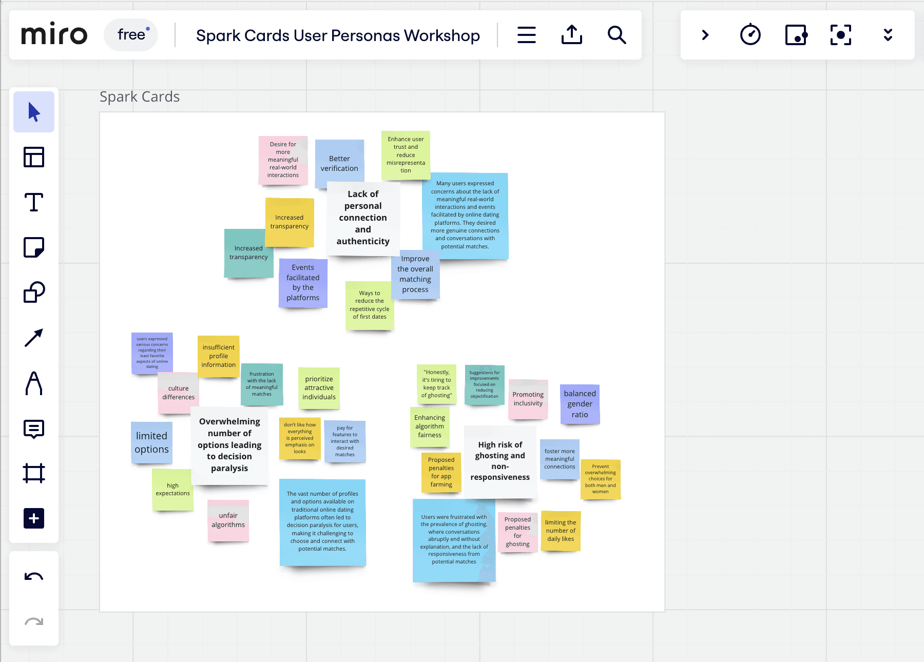

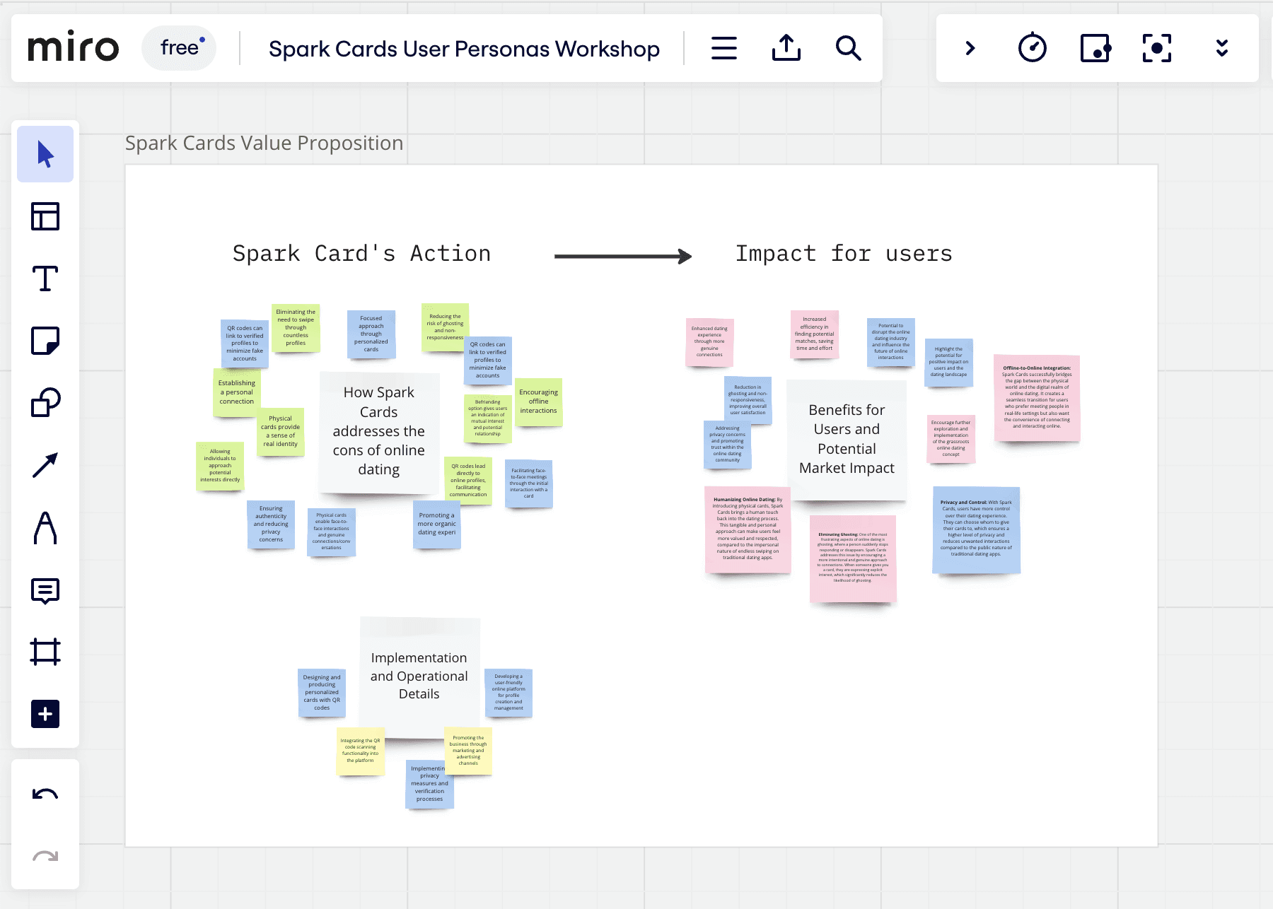

This research offers valuable insights into the world of online dating, uncovering user concerns and providing valuable recommendations for the industry. By addressing issues of algorithm bias, enhancing profile verification, and fostering real-world interactions, online dating platforms can create a more positive and rewarding experience for their users.
Implementing these recommendations has the potential to foster meaningful connections, improve user satisfaction, and drive the continued growth of the online dating market.
Strategy & Design
Enhancing the online - offline experience
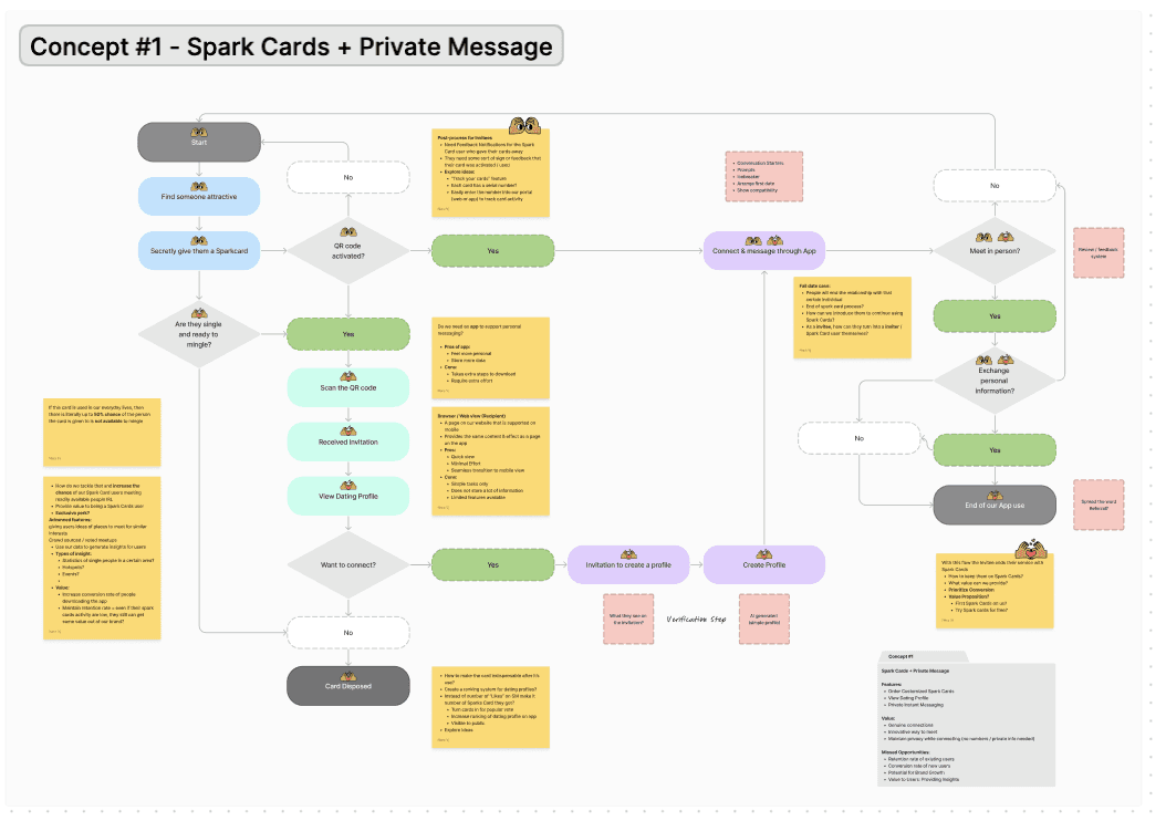

Spark Cards user experience was completely reimagined, supported by thorough user research and driven by a deep understanding of user needs.
Through collaborative sessions, we pinpointed user personas and mapped out the customer journey, utilizing innovative design approaches to introduce features that aptly tackled user issues. This not only elevated the overall user experience but also ensured a harmonious balance between our business objectives and user requirements.
The Solution
Our unique value proposition lies in empowering users to ignite authentic connections through personalized cards and face-to-face interactions.
By fostering genuine conversations and meaningful encounters, Spark Cards sets itself apart from traditional online dating platforms and addresses the key pain points that users commonly encounter.

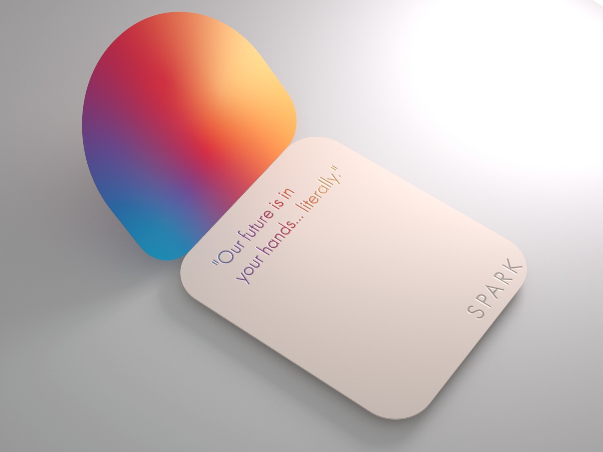
Lack of Personal Connection and Authenticity:
Users can express their personalities and interests through personalized cards
By introducing physical cards, Spark Cards brings a human touch back into the dating process

Seamless Offline-to-Online Integration:
Integrate NFC touchpoints on the physical card to allow users to scan and view their digital invitations from admirers.
The act of giving and receiving a card suggests a more deliberate and genuine interest in getting to know someone
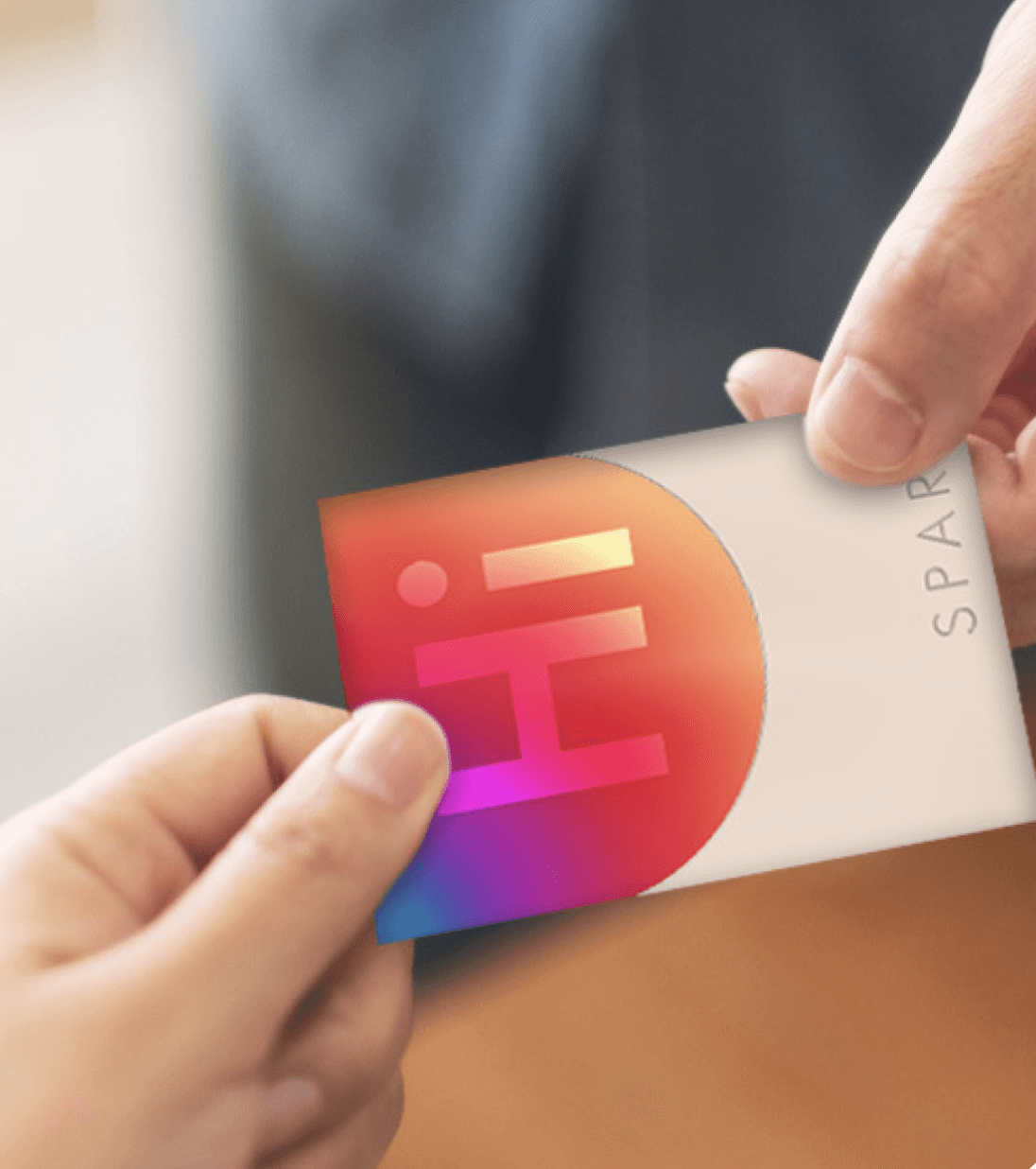

Authentic Connections through App:
Design an engaging digital invitation to encourage the recipient to download the app.
Users may feel more confident and less pressured, leading to more authentic connections and conversations.
View Full Case Study on Desktop
The Problem
Spark Cards disrupts the online dating industry by infusing a grassroots and tangible element into the digital world. Spark Cards offers a refreshing and innovative approach to finding meaningful relationships, appealing to users seeking a more personal and intentional dating experience.
Lack of personal connection and authenticity
High risk of ghosting and non-responsiveness
Overwhelming number of options leading to decision paralysis
Privacy concerns and potential for fake profiles
Limited offline interaction and reliance on technology

Empathizing with our users
Narrowing in the problem
10
Focus groups
310
User Interviews
2600
User Insights


This research offers valuable insights into the world of online dating, uncovering user concerns and providing valuable recommendations for the industry. By addressing issues of algorithm bias, enhancing profile verification, and fostering real-world interactions, online dating platforms can create a more positive and rewarding experience for their users.
Implementing these recommendations has the potential to foster meaningful connections, improve user satisfaction, and drive the continued growth of the online dating market.
Strategy & Design
Enhancing the online - offline experience
Spark Cards user experience was completely reimagined, supported by thorough user research and driven by a deep understanding of user needs.
Through collaborative sessions, we pinpointed user personas and mapped out the customer journey, utilizing innovative design approaches to introduce features that aptly tackled user issues. This not only elevated the overall user experience but also ensured a harmonious balance between our business objectives and user requirements.

The Solution
Our unique value proposition lies in empowering users to ignite authentic connections through personalized cards and face-to-face interactions. By fostering genuine conversations and meaningful encounters, Spark Cards sets itself apart from traditional online dating platforms and addresses the key pain points that users commonly encounter.


Lack of Personal Connection and Authenticity:
Users can express their personalities and interests through personalized cards
By introducing physical cards, Spark Cards brings a human touch back into the dating process
Seamless Offline-to-Online Integration:
Integrate NFC touchpoints on the physical card to allow users to scan and view their digital invitations from admirers.
The act of giving and receiving a card suggests a more deliberate and genuine interest in getting to know someone
Authentic Connections through App:
Design an engaging digital invitation to encourage the recipient to download the app.
Users may feel more confident and less pressured, leading to more authentic connections and conversations.
Design Iteration #1 - Physical Product
User & Product Testing
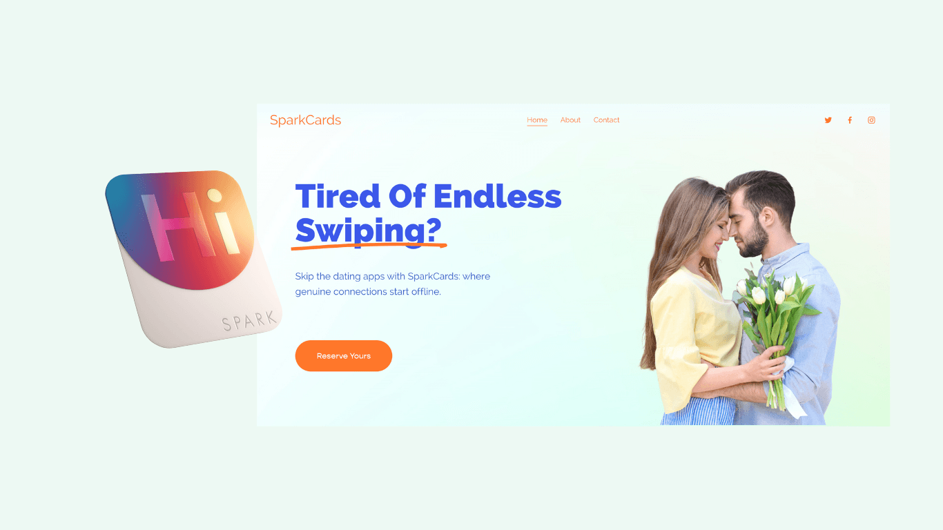
Prior to my commitment to the team, the company had an initial branding. They designed a physical product and website that captures what they want the product to portray. The first thing I did, once I joined, was to carry out user testing on both physical and digital product to see what we can improve on.
User Testing : Web & Physical Product
Durability Test : Physical Product
Heuristics Evaluation : Web
Competitive Analysis: App

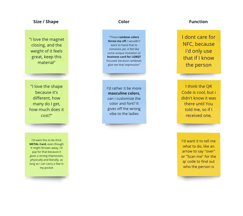
User Testing: Physical Product
Single men 25-35
What do you guys think of the look & Feel, and overall first impressions?
Would you improve anything about how it looks / feels?
Color suggestions?
How much do you spend on dating apps right now, What would you guys pay for a stack of say 10 of these and assume app is free to setup?
Results
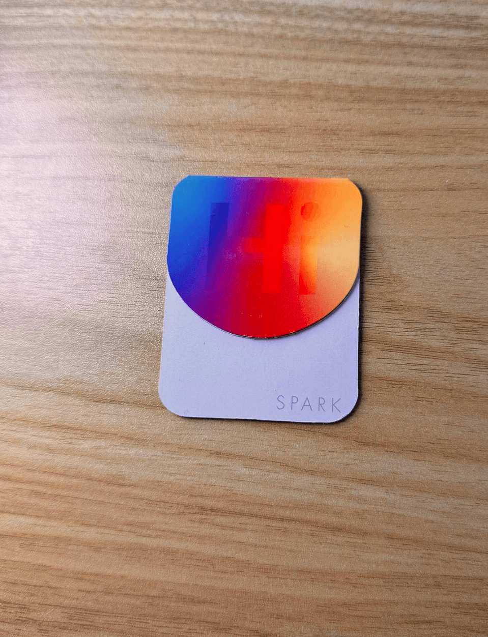
Most common feedback was on the rainbow color. Individuals felt that the product instantly reminded them of the LGBTQ+ community.
It was very important for users to feel represented through the physical product that works as an extension of themselves.
Durability Testing
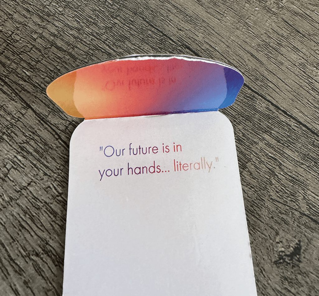
Our team also wanted to test out the durability of the card when used in everyday life.
Our team members used the card for a week and came back to discuss potential improvements for 2nd iteration.
Results
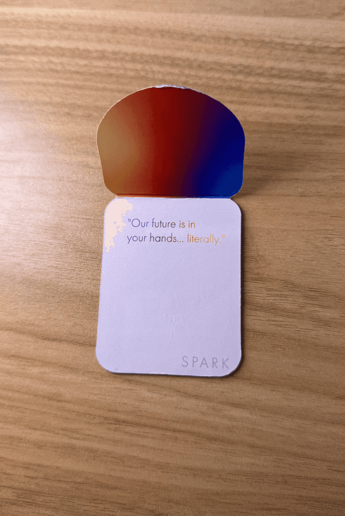
Unfortunately, the print of our first prototype was not as vibrant as we designed.
The rainbow colors made the printed message hard to read.
Plastic material also started to peel.
Design Iteration #2 - Physical Product
Applied data points to design decisions
Data from our user research shows that users specifically Gentleman, want the card to represent themselves as much as possible.
Having a card that signifies the wrong intention is a very high blocker to enjoy the product.
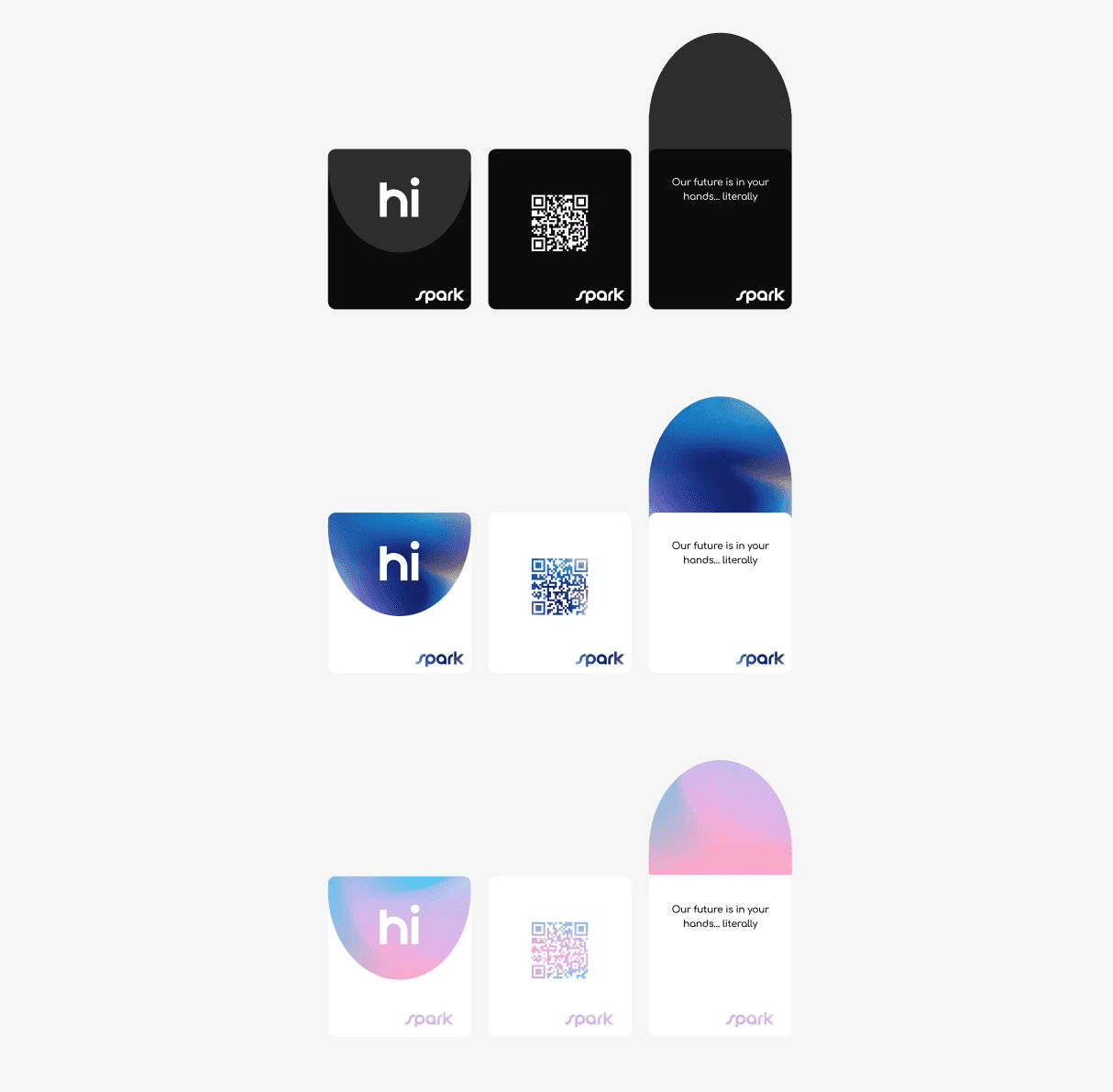
Issue #1: Misuse of Color
Create 3 card designs, 1 colored for Gentlemen, 1 for Ladies, and one Neutral for everyone to enjoy.
Design Decision:
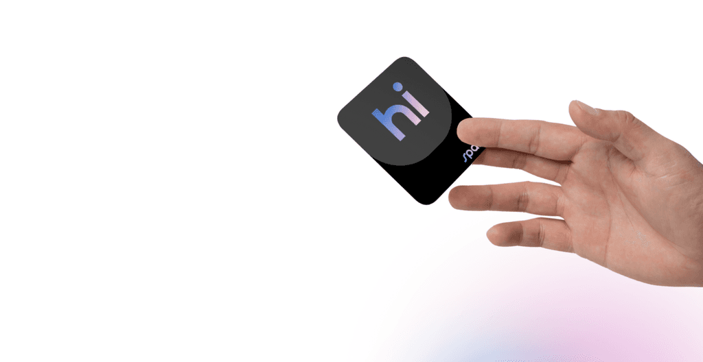
The prototype showed a lack of contrast between the text & background color making it very hard to read.
Issue #2: Accessibility
Change the font, create a bolder text and remove the gradient to improve text visibiity.
Design Decision
Issue #3 : Brand Recognition
Bridging products through visual language
The biggest feedback that we got was that people don't see a relation between our physical and digital products.
Our website color and style does not carry its meaning through to the product nor does it vice versa.
Design Decision:
Create a logo or branding that represents our brand. The goal was to design a logo that represents our physical products digitally.




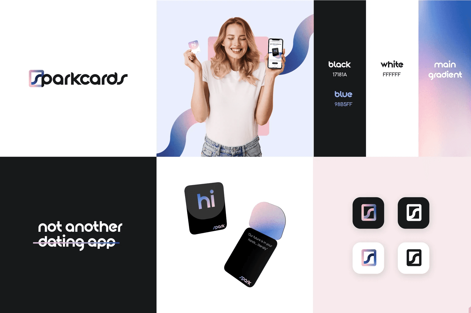
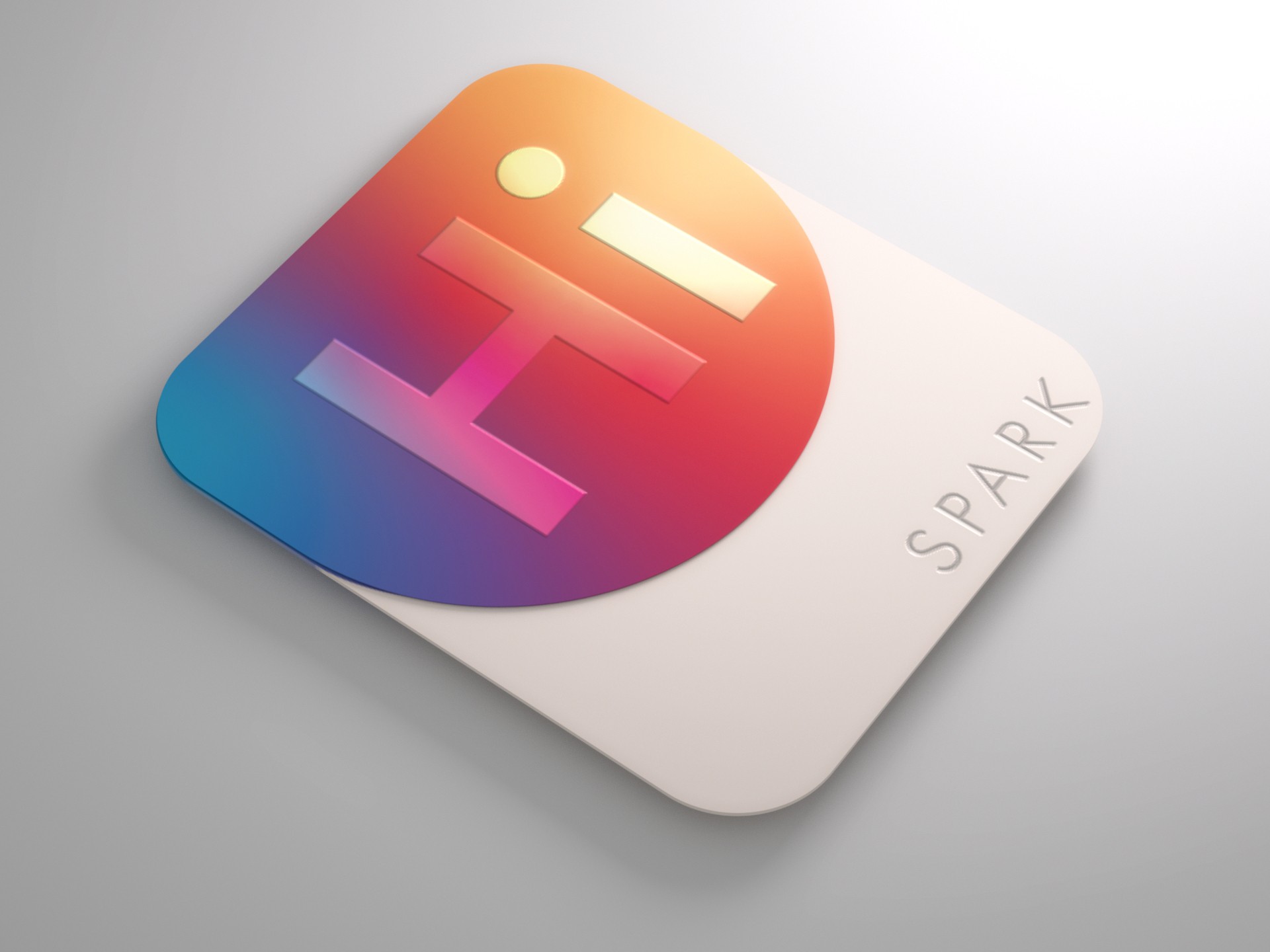
My responsibilities also included re-branding, style guide, and physical product design
To match the new UX Strategy, a new branding was conceived and designed. I prioritized the card design and tried to incorporate our physical product into our digital branding.
The goal was to create a logo & branding that people will recognize our physical products from our digital platforms.

Design Exploration
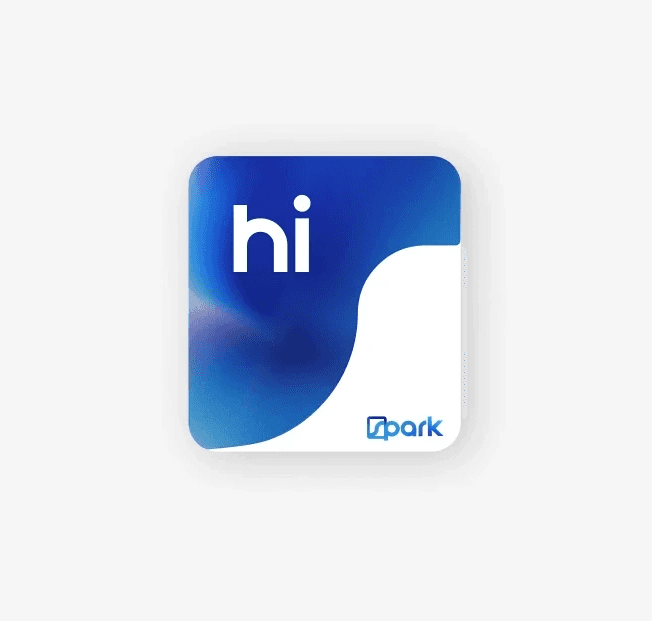
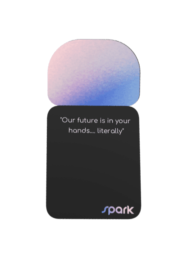
Once we got our logo, I wanted to find a way to represent our digital branding through our product. So I in cooperated the S shape onto our physical product.
It resulted in this amazing curved shape on the card and our team loved this design!

Digital Product Design - Web
Re-designing the Landing Page
The goal of this re-design is to align the landing page with our new branding. Branding is not just a logo or an aesthetic theme, it is our identity and the value we want users to see instantly when they come across our product. The result of this re-design should create a cohesive branding language across both digital and physical products.
Status: Estimating built effort
Role: Lead Designer, Interaction designer, Visual Designer, Prototype, Design System
Platforms: Desktop web / mobile web
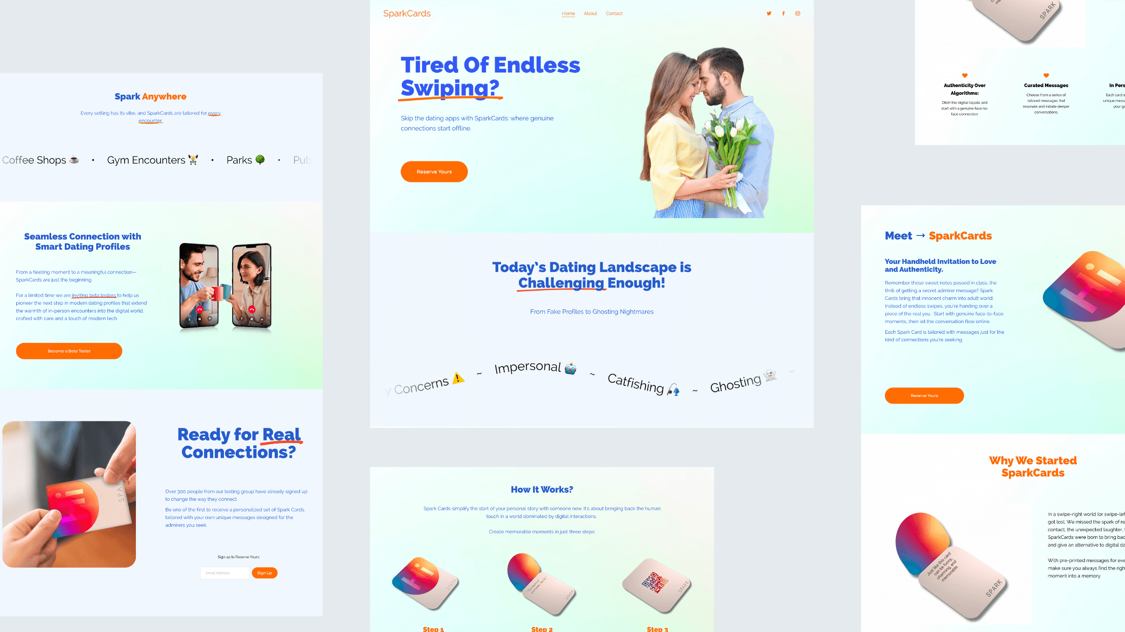
Heuristics & Accessibility Evaluation - Web
Identifying areas for improvement
To address the improvements that can be made on the current website, I tested the site through the WCAG accessibility tester.
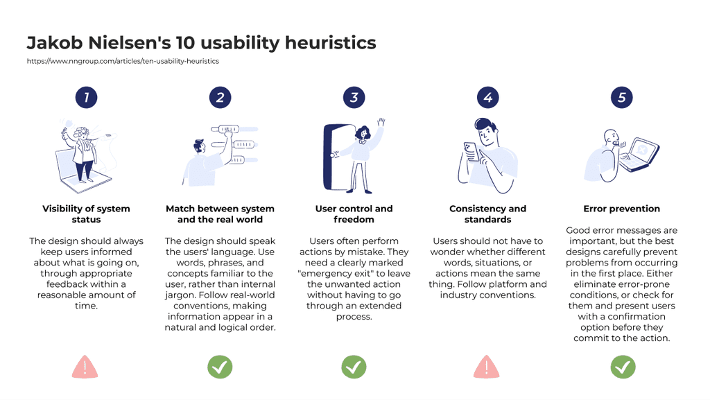
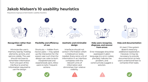
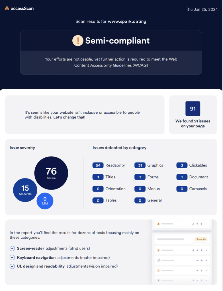
Problems
Identifying Primary Problems
We need to pinpoint possible opportunities of improvement to enhance aesthetic components throughout the site. Additionally, addressing heuristic & accessibility concerns.
After our research & heuristics analysis, our team identified 3 primary problems with the old website
From the user interviews we did with our user group, one of the biggest feedback was the lack of brand recognition between our products.
Problem #1:
Lack Brand Recognition
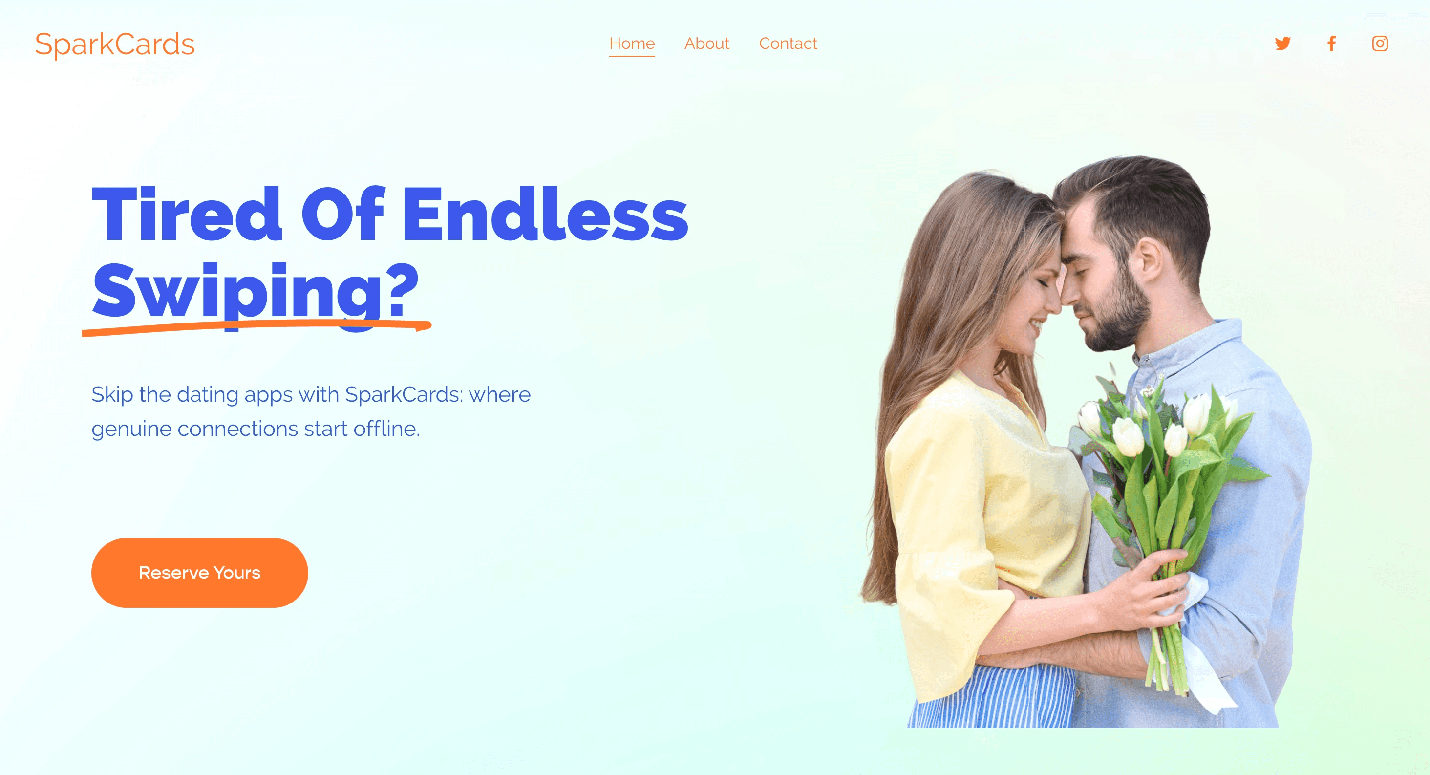
People mentioned some images on the page are misleading and confusing for users to understand what our product is. It is NOT a dating app!
Problem #2:
Misleading Feature Highlight

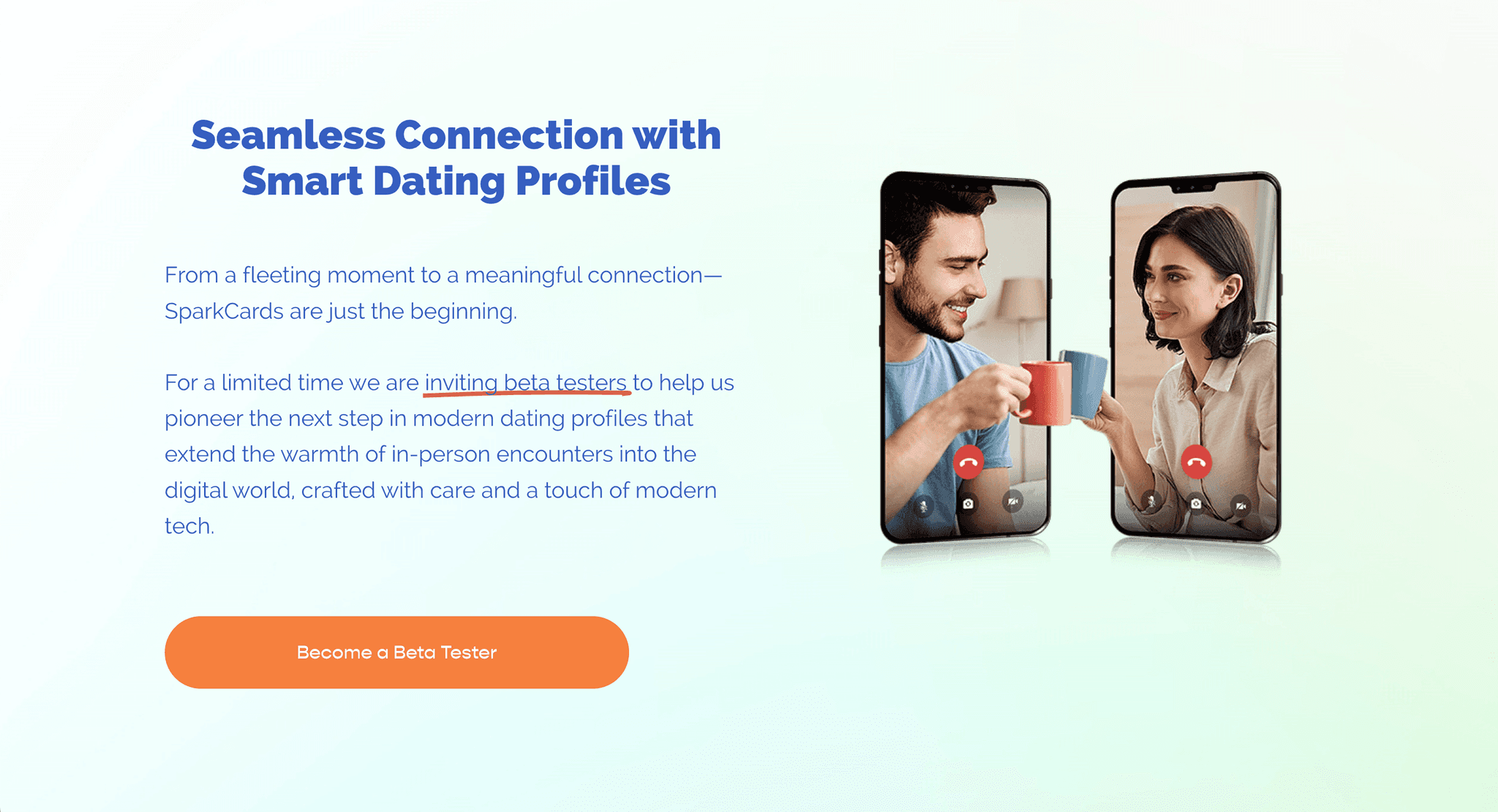
People mentioned that some animated sections was not responsive on their device.
Problem #3:
Lagging Animation


Opportunities - Landing Page
How might we make the product landing page minimal, cohesive branding, and engaging?
We need to convert our key problems and pinpoint possible opportunities of improvement to enhance aesthetic components throughout the site. Additionally, addressing heuristic & accessibility concerns.
1.Lack Brand Recognition
Cohesive Branding
The new website design should reflect the new branding that is integrated in all our products. Users should be able to recognize our physical products through the website.
2.Misleading Content
Relevant & Engaging
The re-design should include only relevant information that is prioritized for new users who are interested in joining the Beta Program.
3.Lagging Animation
Minimal Design
Instead of using text animation, our new design should prioritize accessibility. Showcasing the product in a clean, sleek and modern way.
Design Iteration #2 - Web
Brainstorming & Mood boarding Session
Our team got together to brainstorm the concepts we want to move forward with that best represents our brand.
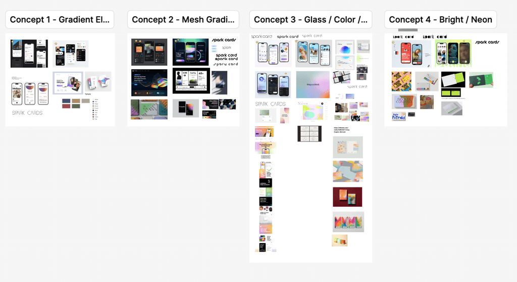
UI Design Language
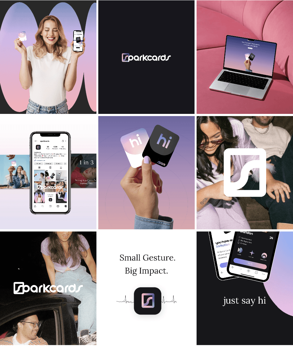
The current site is hosted on Squarespace, so with the platform. My goal was to create a new web design that embraces our new branding identity within the built constraint of the platform.
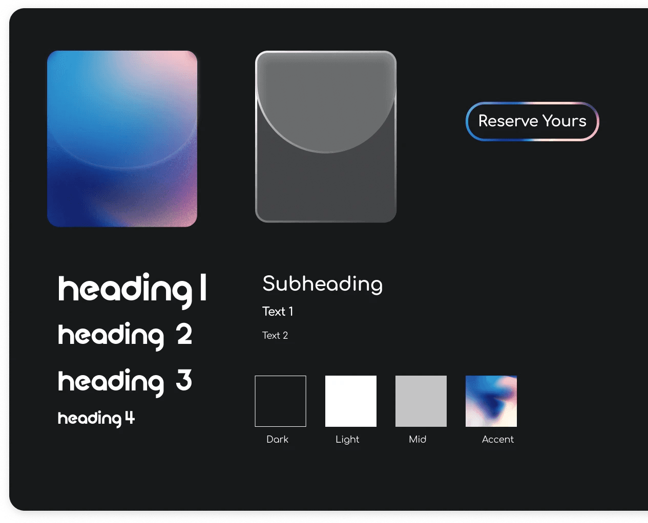
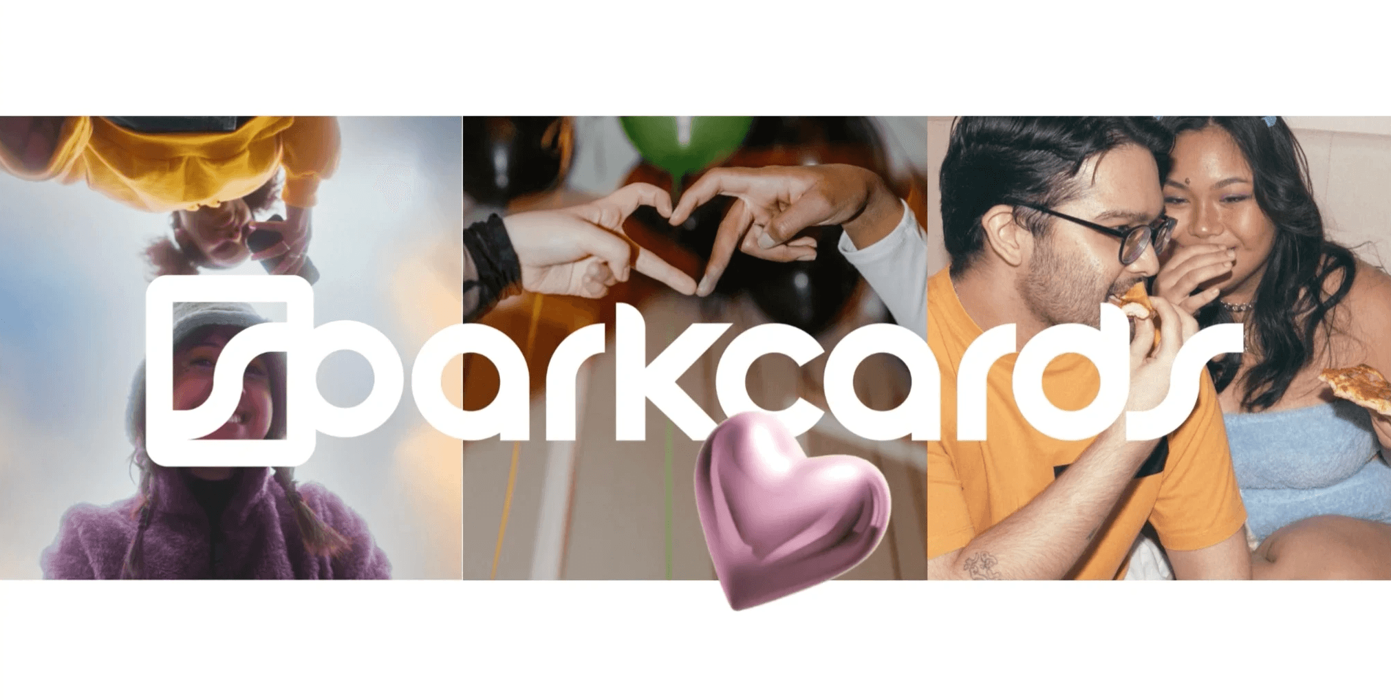
Final UI Design & Branding Kit
Digital Product Design - App
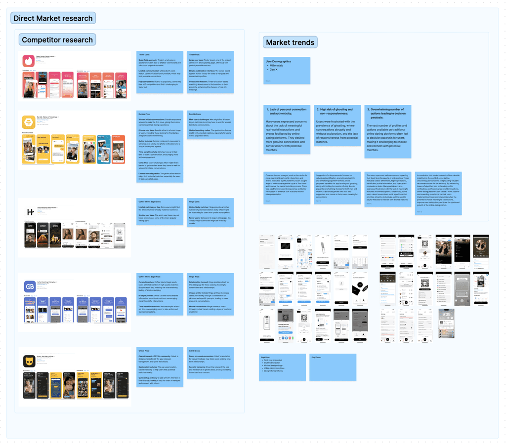
Competitive Research
To benchmark our innovation to the real world, we wanted to find out the user experience that was common and trending across existing dating apps. We prioritized the most popular apps such as Tinder & Hinge. We also benchmarked our physical product with existing brands such as Dot & Popl.
Counter to what other dating apps are known for, we want to steer away from those features. Whether it be swiping profiles, paywalls to upgrade features or blocking profiles, we want our app to stand out as NOT being another dating app, but rather a formal digital invitation to genuine conversations.
Digital Product Design - App
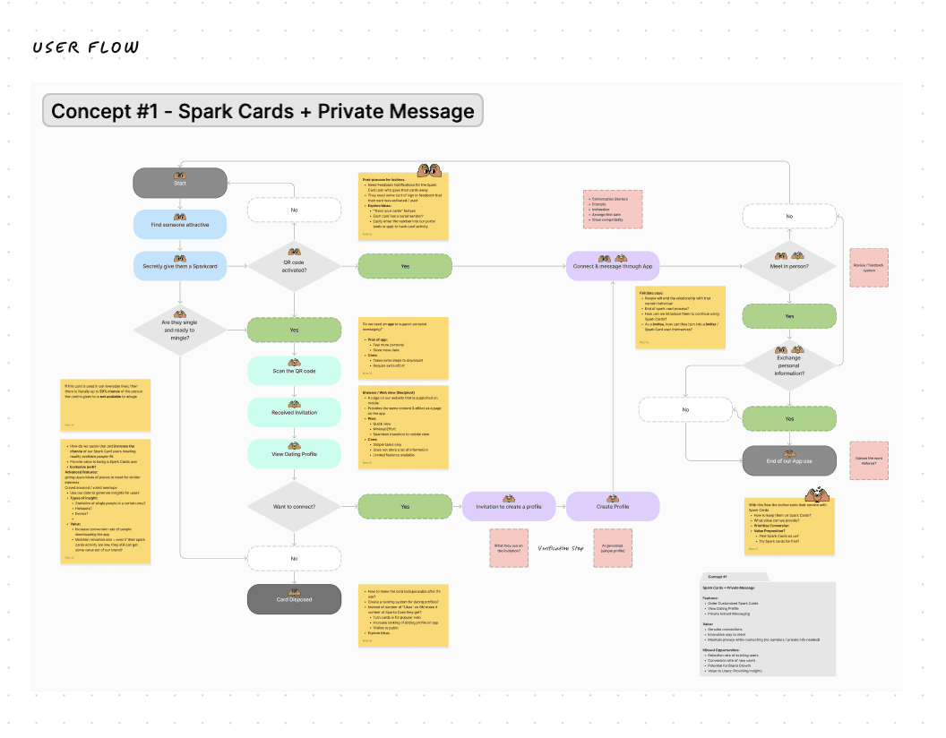
Understanding the User Flow
At this stage, our goal is to create a simple interface for users to test out the product. The biggest question is whether we should build an app with half of the features or a browser view for our first release.
To address this query, I laid out the simplest user flows while identifying areas of opportunity to enhance in later development phases. The challenge here was interpreting the vision of our team into tangible steps that make sense to users. For our first MVP, we concluded that we will focus on two main use cases: 1. Inviter and 2. Recipient.
Takeaways: From laying out the user flow, we identified that it is best to start our user journey on the browser view to keep our built effort minimal and to hone in our time on building the rest of the app with full-fledged features for our next MVP.
Digital Product Design - App
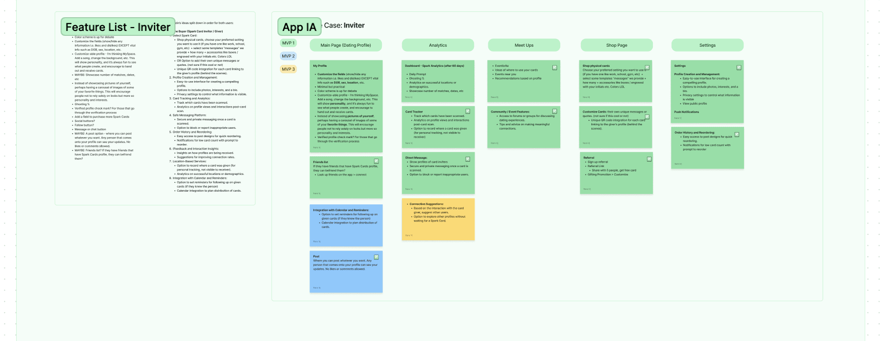
Prioritizing Features from Built Efforts
Once a user flow is identified, I led a card sorting session with the team to form a cohesive site map for our app. We identified five different pages that make sense for the different features we want to have.
The significance here is to identify the build effort for each feature. I utilized a color code to represent the features we will include in each MVP. In collaboration with our developer, we concluded keeping two features for MVP2 and working on an AI feature that will take more time to integrate into the later MVPs.
Digital Product Design - App
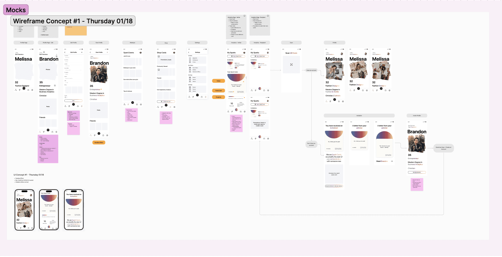
Bringing Our Ideas to Life
For our first draft, I created lo-fi wireframes for the screen flows we hashed out earlier. The goal of this stage is to align the team's expectations of what the screens will look like. I led the first Design Critique session and noted down the feedback from the team to work on the next iteration.
Stay tuned for updates, or connect with me for more!
neennv@gmail.com
Focus on how it feels also how it looks
Focus on how it feels also how it looks
